Matter of Monument

Title Matter of MonumentYear 2011Size A0 (84cm x 118.4cm)Technique Silkscreen 5 coloursEdition 4 x 50Commisioned by Castrum PeregriniPrinted by Kees MaasFor saleSold outCollection Stedelijk Museum Amsterda, Castrum PeregriniAwards Dutch Design Awards 2011 catagory: Best Graphic Design


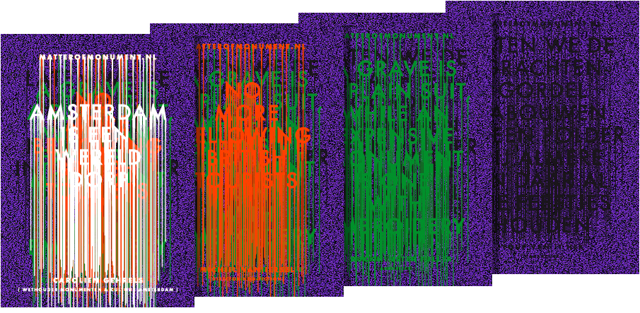
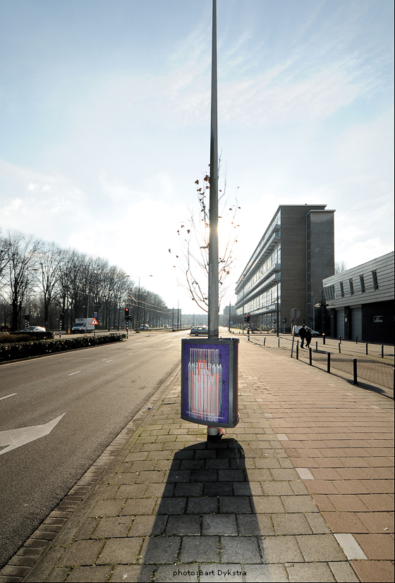
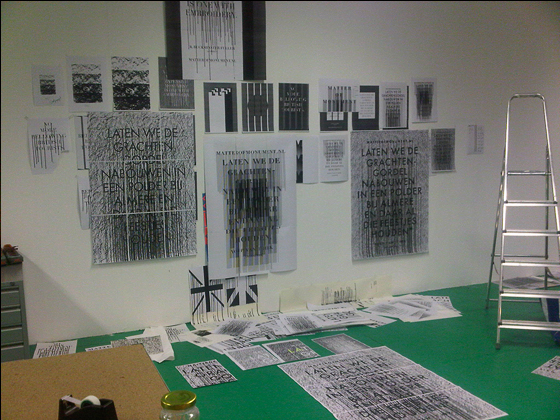
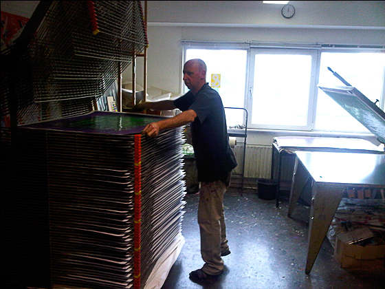
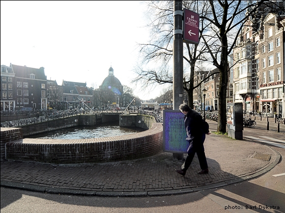
This posterseries is one of the most complex things I’ve ever had to design. I can still remember the euphoria when I was asked to come up with a set of A0 posters for the triangular poster system that is used in Amsterdam. I’ve been designing posters since 2006 but I never had the chance to reach a broad audience since poster culture is marginalized in Amsterdam these days unless you have a big budget. And there it was - the budget I had been dreaming about - enough to have the entire set silkscreened by Kees Maas a silkscreener who I have been admiring since I became a graphic designer.

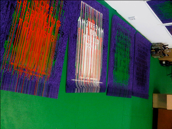
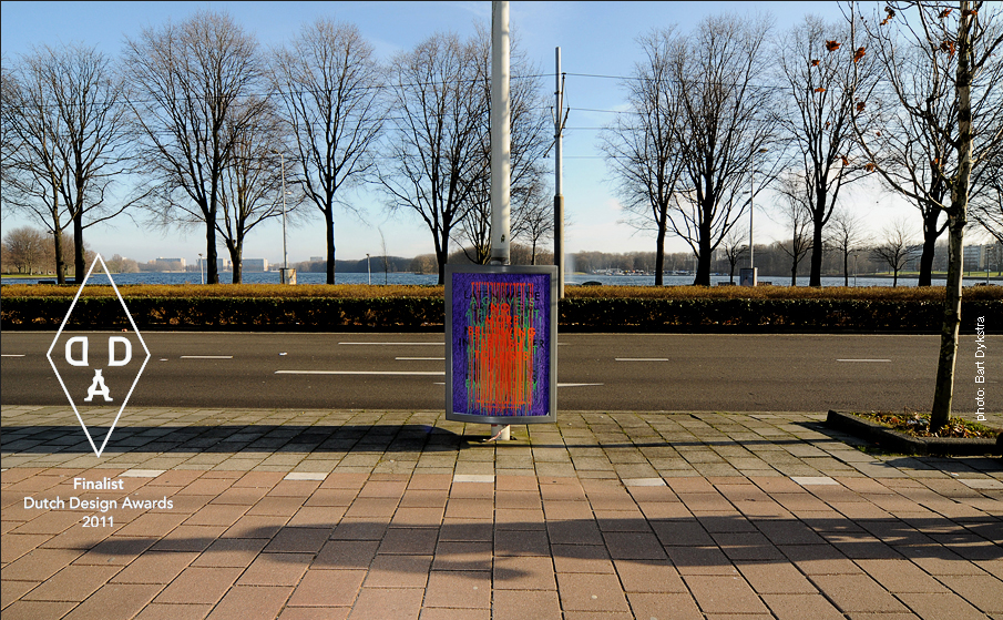
I had a meeting with my client and I realized that they wanted something more complex than an exhibition title on a piece of paper. First of all they didn’t want to directly advertise the exhibition. All this would be covered by an other agency. My role would be more provocative - to take part in the exhibition on the outside of the exhibition-space.


Matter of Monument briefing
Parts of downtown Amsterdam have been added to the list of UNESCO-world heritage sites in 2011. History suggests that this label would make Amsterdam a more attractive place for tourists and investors. This unfortunately also means that it will be harder to make changes in the urban structure of Amsterdam because this status has to be protected. To exaggerate this a little; Amsterdam is doomed to be some sort of an open-air museum. The Matter of Monument exhibition can be seen as a collection of opinions about this development.

What they wanted me to do is to show the Amsterdam public some of these different opinions. I was assigned to display four quotes on the subject (by four prominent ‘Amsterdammers’) with my trademark-typographical-approach.

Concept
I had a hard time with the copy. The longer I worked with the quotes the harder it was to identify with them. They were rather pompous and exaggerated. I had to find a way to show that they were just opinions - and not opinions neccesarily shared by the organisation of the exhibition. After a lot of experimenting I came up with this as a possible concept:


Sometimes searching with Google can really help to make a concept concrete. In this case
I used the query ‘defaced monument’. That was the solution - a monument (in a way, the Amsterdam triangular poster holders) defaced by grafitti (strongly personal opinions).

Typography
Obviously I could have used hand written type but I didn’t. I used a ‘normal’ typeface (Futura in capitals) because it should not be about the opinions of grafitti writers but about the opinions of prominent 'Amsterdammers'. I also wanted a contrasting effect with the drips. The centered alignment makes the poster more monumental and grave-like. The Futura's Trajan-like (classical roman ratio) shapes typeface also contribute to this.


Colors
The choice of colors was technical. I needed three colors with the highest mutual contrast. I didn’t want to use the primary (cyan magenta yellow) colors because of their abuse in popular culture. I liked the idea of starting with purple, because I see purple as the royal color of emperors and popes. The orange and green complement this purple. I also added black and white to give a sense of depth.

Silkscreen
Silkscreen printing is the best technique to print these posters because it enables printing with opaque colours. The grafitti feel was achieved by physically printing opinions on top of each other. Another advantage of silkscreen ink is that the colors are more vibrant due to the thicker layer of ink and therefore larger amounts of pigments. This, along with the drip effect, resulted in people actually carefully feeling whether the ink on the posters was still wet.


All Work