We Like Art

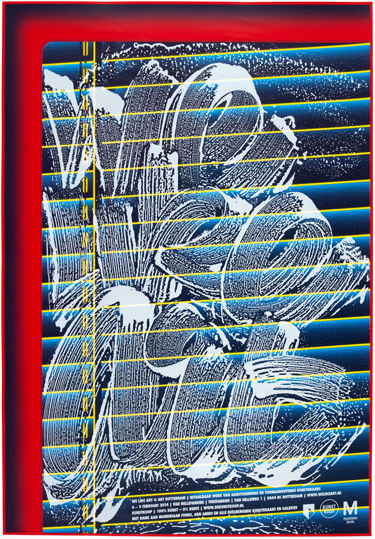
title: WE LIKE ART
year: 2014
size: individual poster: 70cm x 100cm, wall: about 10m x 3,5m
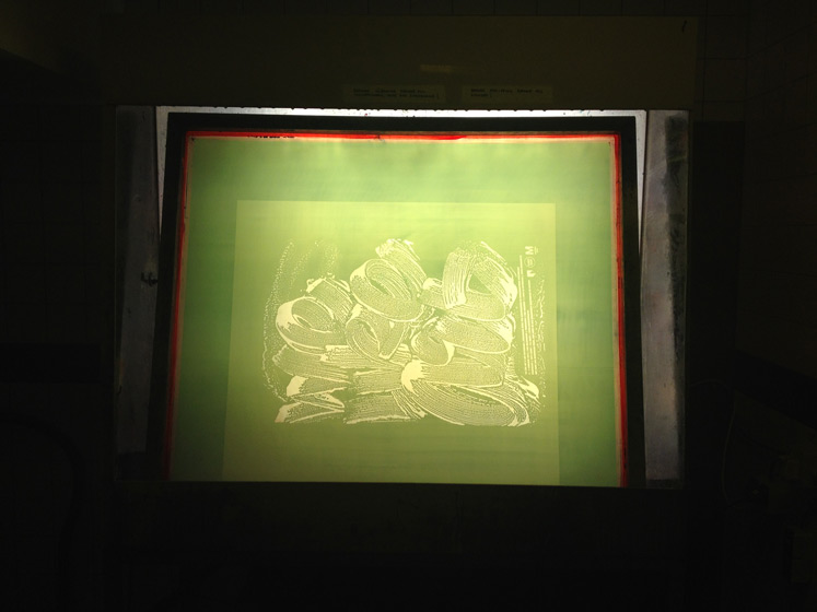
technique: Silkscreen 3/4 colours
edition: 100/70 with text
commissioned by: WE LIKE ART
printed by: Michiel Schuurman (assisted by Maurits Rozema)
for sale: Only the text version is for sale 250 euro (incl. post and package)
ABOUT THE PROJECT
This is a project of which in hindsight I think I've made some mistakes. Don't get me wrong... I think it has huge potential but I tried to do too much at once.
The top shows the original sketch for a wall installation I designed for WE LIKE ART, an organization that successfully couples art lovers with a tiny budget to well known artists who are willing to sell some of their work for a small fee.
They asked me to design a wall in their upcoming exhibition at the famous Van Nelle factory in Rotterdam.
I came up with an idea to do a poster that when repeated on a wall forms the illusion of a window. The design is loosely based on the architectural features of the factory. A seperate poster with (soapy) typography could then be sold advertising the WE LIKE ART exhibition... so far so good.
I am actually really pleased how both posters turned out.

The concept became cloudy when we thought it would be a cool idea to also sell my old works. I made a proposition to place these posters on the wall as well... a bad decision because it weakened the initial idea.
In addition we found out that we were not allowed to stick the posters directly to the wall resulting in my posters hanging loose from the wall held together by tape. This all resulted in a rather clumsy exhibition from my part.
These things happen... you make rash decisions when you're hurried. It's not something that can be blamed on somebody, certainly not on the WE LIKE ART crew who cooperated and were openminded on every level... these things just happen sometime.
WE LIKE ART was happy with the result and so am I to a certain point but....
I will do this wall again and I will do it properly next time. The devil is in the details.

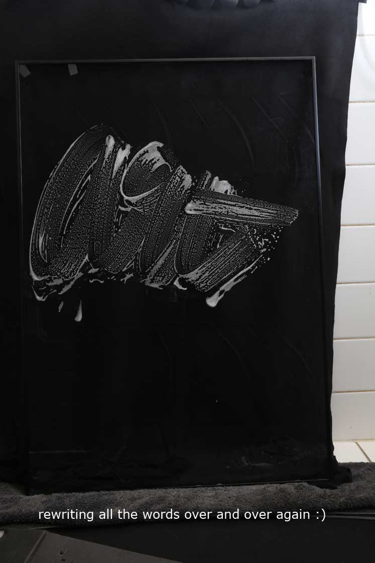
SOAPY LETTERS
A lot of fun... it is actually very rare that I don't use computer type so this was very educational for me. I wrote the words hundreds of times on a glass frame and photographed them in my bathroom.


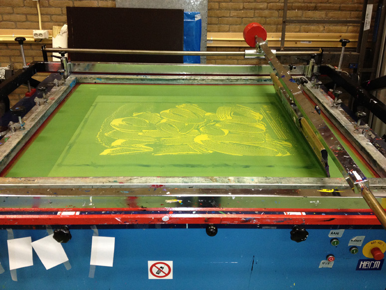
PRINTING
It was HARD work I can tell you that... we filled every single drying rack in the studio.